October 02, 2024

7 tips for app icon design

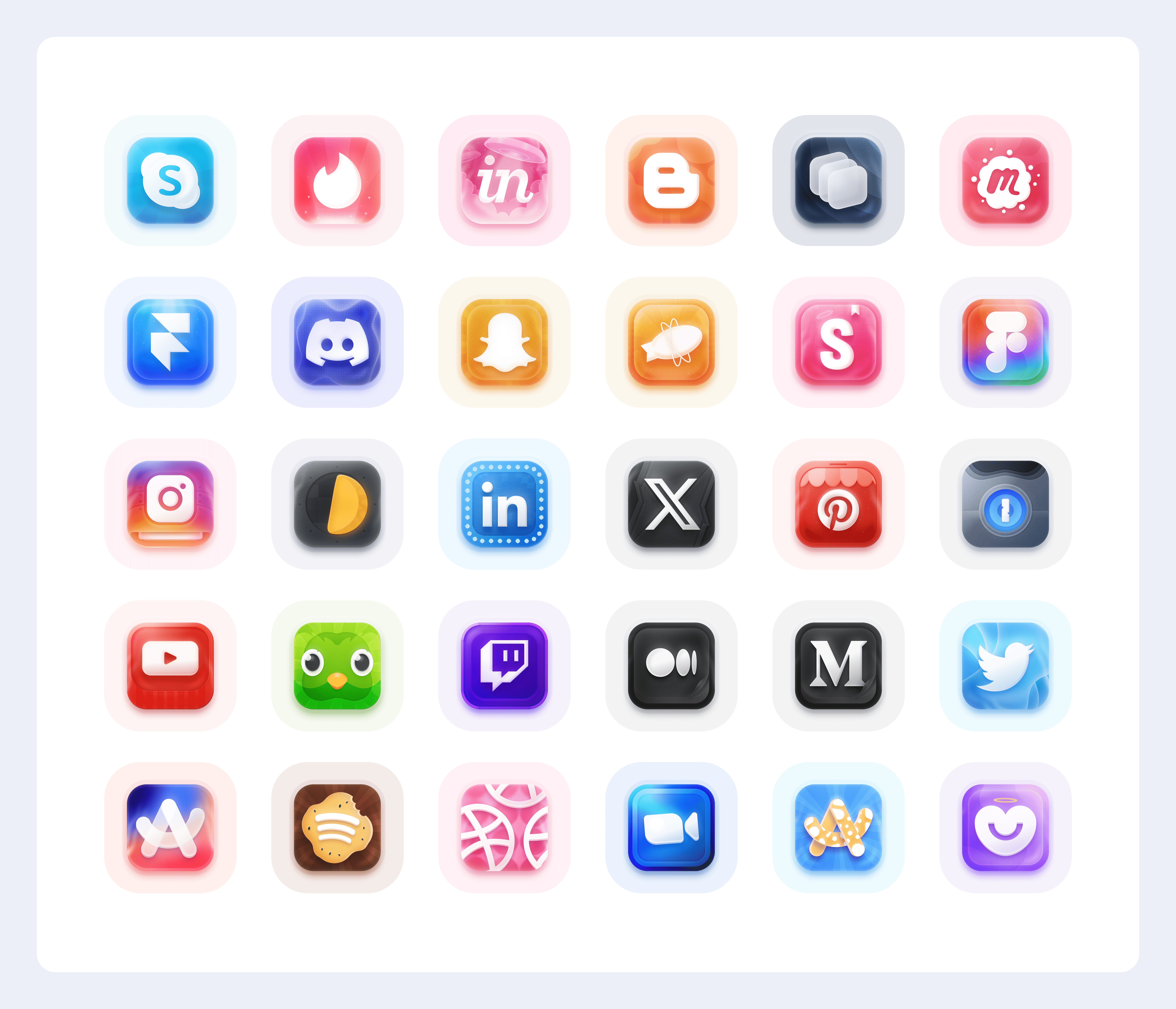
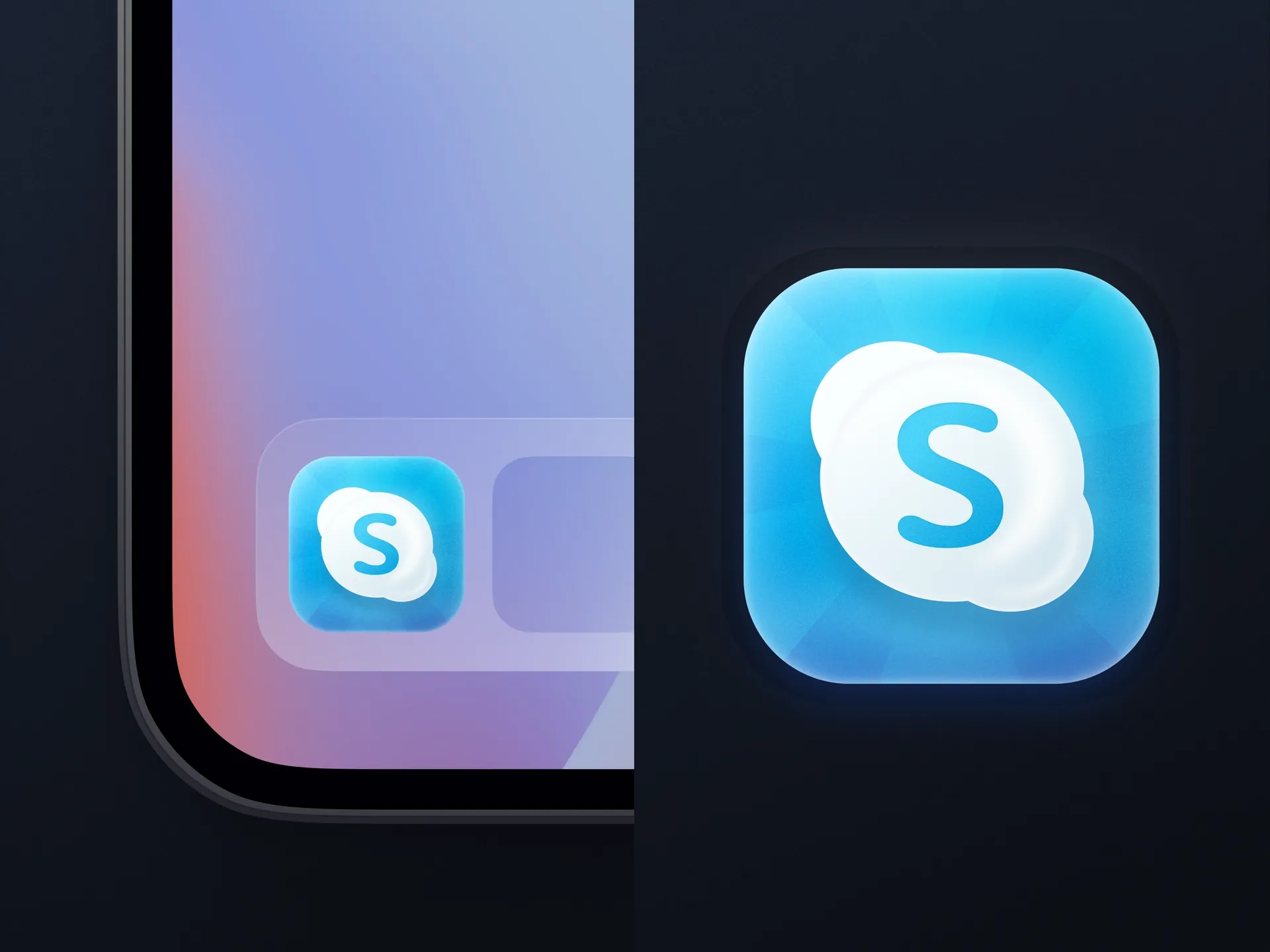
App icons play an important role in the click-through rate (CTR) of a mobile app. First impressions matter a lot, so check out these tips for creating an app icon:
b7425cce-46f6-4a03-9592-c7f18dc9bcc7-all.pngdfa73844-ad47-4b34-9825-faa7839ce968-iOS-app-dock.webp

1. People are looking for an easy way to get something. That's why your app icons should be clear and easy to understand.

c074c087-a4a0-4285-9930-dc8539d18aa3-Frame-172.webpff159a30-2437-4538-997a-949af25d6246-Twitter.webpc5b591ba-79d1-4792-b0ed-0fc432997897-Frame-271.webp

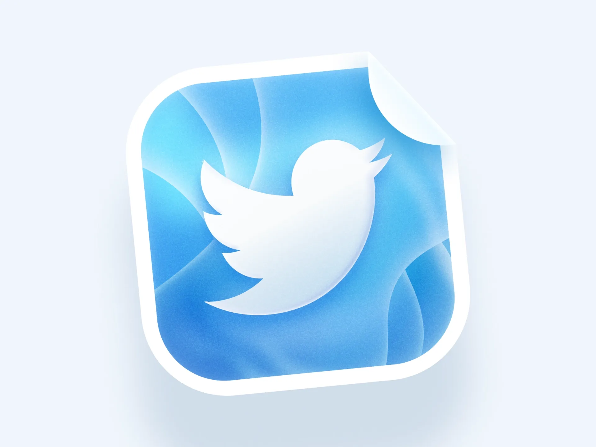
2. Make sure your app icon design is concise and conveys the core functionality of your app. Avoid abstract icons that don't allow users to understand what your app is about.
38160300-3a72-4c80-8209-171b91627b9e-Figma2.webp973c31e7-b57b-4b2f-9dee-54ef1b5dff60-Pocket.webp414f28d0-9139-40ed-9177-e848c879401e-Blogger-Dr-1.webp660a7619-206a-4210-85f4-f53f5ac98bd3-Discord-2.webp

3. Bright colors help the app to attract the user's attention. But do not use too many shades - one or two main colors is enough.
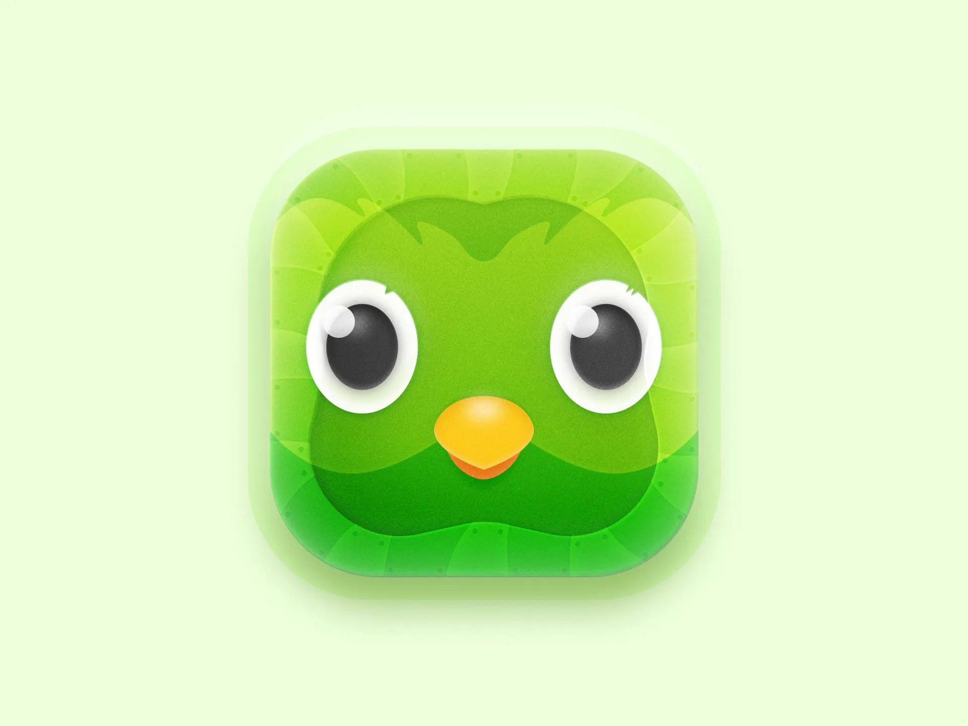
2cb679e7-b35e-4ad6-a876-12e93fb9278c-1Pass.webp5cc9a9ba-c6af-4169-b9ac-8662ac56a87c-Doulingo-dribbble-1.webp5df017d8-0c92-40da-af72-0be079fd370a-Blogger-Dr-7-Layer.webp8b08c423-9e3f-45f7-9ddd-66f49b844a7c-Blogger-Dr-5.webp84ad307c-b656-4d18-855f-505cb9b78477-Youtube-dribbble.webp3e07bedf-6133-4277-91e0-480764b428a9-Badoo-2.webp

From $2,999

Unlock Your Projects's Potential with our Awesome design package
Have a Questions?

Design Awesomeness awaits!

Your name
Your phone number
Write your question